Audio recording
When you need to convey a message with images or words, understanding colour theory can help you convey your message accurately and effectively. In this episode, I’m going to explore the basics of colour theory, including how to choose colour for your graphics and design projects. Using the principles of colour theory in your marketing and graphic design process can help make your messages more memorable, understandable, and persuasive.
Colour is everywhere in our lives, it can be used to raise awareness and drive purchasing decisions. It’s also a powerful tool to help create a mood or evoke an emotion. Colour theory is the study of how colours interact with one another, and the meaning they represent to humans. This episode will help you understand colour theory, how it works, and why it’s important for your organization.
Mentioned Resources
Episode Transcription
Colour theory is what you need to know about selecting colours for your design process. Colour can be a powerful tool in branding, communicating your message and creating a cohesive feel. It should not be overlooked in the design process.
There are two groups of colours, Complementary and analogous. complementary colours are the ones that sit opposite each other on the colour wheel, like purple and yellow. They create a strong contrast, but when together they are very bold and vibrant. Analogous colours are those which sit next to each other on the colour wheel, like blue to turquoise to green, they provide less contrast when put together, but their similarities will make for a more cohesive feel.
To effectively convey your message through colour you must understand colour theory you need to know how to appropriately use it in your design process, as well as utilize it strategically in marketing efforts. Choosing the right colour can have a huge impact on how your audience interprets your message.
What you use in your design process has the power to evoke certain emotions, create an affinity for your brand, or simply attract attention. How you use colou will depend on what it is that you’re trying to communicate. Some colours are more energetic than others and can be used to stimulate thinking or produce excitement. For example, a vibrant red might make someone feel passionate about what they’re reading. Other colours are softer and more soothing. These types of colours would be better suited for situations where one needs calmness or relaxation. A gentle blue might create a sense of peace with its common hue. Let’s say you’re trying to paint a picture of tranquility through the use of colour. A serene blue paired with soft lighting would make a perfect scene for this type of environment. It’s important that you understand what effect each different colour will have so that you can choose the one that’s best suited for your project.
You don’t want to unwillingly evoke anger in your audience if you were hoping they’d be happy. It’s much easier to create the reaction you want by understanding which colours will naturally produce these feelings in people, and then including them in your design process accordingly.
You might be thinking, David, how do I choose the right colour scheme for my message? Well, when you’re choosing a colour scheme, you need to be thinking about the message you want your brand to convey. For example, do you want your brand to be masculine or feminine? You also need to consider what colours resonate most with your audience. What colours are they drawn to? To figure out this information, think about who is your target audience and what they would be drawn to when it comes to colours, think about their favorite movies, shows, food, etcetera. Once you figure it out, which colour scheme would best represent your message in the audience you’re trying to reach the most.
You’ll know how much of an impact colour theory can have on how well people will understand what your organization and your brand symbolizes.
There are many colours in this world and every colour has a meaning.
Colours can evoke emotions as I’ve mentioned before, create a mood and even tell a story. Colour is one of the most important elements to consider when designing a website or other type of marketing materials. When you choose your colours, it’s critical to know what effect they’re going to have on your audience. You may be tempted to just grab any colours that look good together and call it a date. But this is not always the best idea. There are two main types of colour schemes, complementary and analogous. As I mentioned before, complementary sit across from each other on the colour wheel and analogous sits next to one another.
If the style you’re going after is bold and in your face, complementary is usually the way to go. If your brand is trying to be more cohesive and balanced, analogous style is the right way to go.
I always recommend to our clients that it’s important to have one colour in your tertiary colour palette that is bold and stands against the others.
That way, when you need to make a very clear, strong call to action, you can make sure that it’s going to stand out in your design.
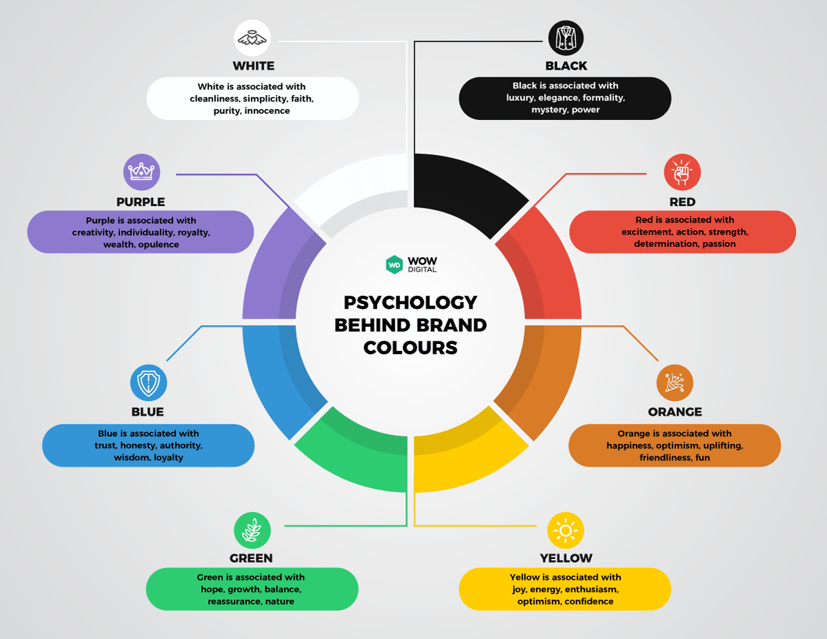
What I’d like to do right now is talk a little bit about the eight big brand bold colours. That’s white, black, red, orange, yellow, green, blue, and purple. White is associated with cleanliness, simplicity, faith, purity, and something innocent.
- Black is associated with luxury, elegance, formality, mystery, and power.
- Red is associated with excitement, action, strength, determination, and passion.
- Orange is associated with happiness, optimism, uplifting friendliness, and has a fun vibe to it.
- Yellow is associated with joy, energy, enthusiasm, optimism, and confidence.
- Green is associated with hope growth, balance, reassurance, very natural, earthy environmental colour.
- Blue is associated with trust, honesty, authority, wisdom, and loyalty.
- Purple is associated with creativity, individuality, royalty, wealth, and opulence.
On the podcast episode page, I’ve got a great colour chart for you to come and grab and use with your organization as you talk through the different types of things that you need to think about when it comes to colour theory and what the different colours and the psychology behind them mean. Just head over to wowdigital.com/032 and that will take you to this episode’s show notes page. I’m also going to include some links to some websites with other resources for you and colour selection tools.

As you’re probably aware, color is often the first thing people notice when they interact with a product or service, it can be used to convey a message or to create an emotional response, which will, in turn, help your brand stand out from the crowd.
When designing your brand, you need to decide what message you want to convey and choose the right colors for your design. What kind of message are you trying to get across? Are you looking for something bright and vibrant? Are you aiming for something calming? What is the overall feeling that you want people to have when they interact with your brand? All of these choices will affect the colors that you choose and the way you use them in your design.
When choosing the right color scheme for your message, there are three main considerations, primary, secondary, and tertiary colors. When we talk about this with regards to a brand guide, the primary colors might be the one or two specific colors and hues that you use as your organization. These are likely the colors that are in your logo. The secondary colors are other colors that you want to use to make something pop out or stand out. And they go really well with your primary colors, the tertiary colors, these ones are more used to create contrast in opposition to the primary brand colors. When we talk about primary colors in color theory, the primary colors are red, yellow, and blue, which can be mixed. Create every other color. Secondary colors are green, orange, and violet, and the tertiaries are brown, purple, and pink. It may seem like a lot, but once you really understand how color theory works, it’s going to be easier for you to get the right message across in your design.
I hope you’ve enjoyed this episode and I’m looking forward to having you listen to the next ones that we’ve got coming up. If you’ve enjoyed this episode please leave feedback on iTunes or wherever you listen to this podcast, I’d love to hear your feedback and it would also help others find the show.
Be sure to check out the show notes for the episode, head over to wowdigital.com, click on podcast, and search for this episode number and you’ll find all the links, details, and other information that has been discussed in this episode.
Are there any other topics that you would like to hear about? Just send an email to [email protected]. Thanks for listening to the Non-profit Digital Success Podcast!


0 Comments
Trackbacks/Pingbacks